What are charts
What are charts
The trading chart displays information that can help you decide when to enter and exit a position.
There are many kinds of trading charts: bar charts, line charts, point and figure, market profile and
candlesticks. ... Each stick and wick on the chart tell you where the market has been and where it
could be going.
Types of trading charts
There are three main chart types that are popular among trading circles. Each chart type offers a
variety of different information according to the traders’ individual skill level:
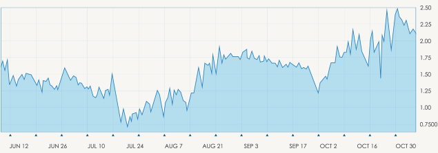
Line Chart –The line chart is formed by connecting the closing prices over a set time frame.
There is no visual information or trading range, meaning no highs and lows and nothing on
opening prices.
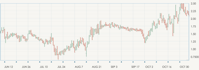
Bar Chart – Expanding in more detail on the line chart, the bar chart includes several more key
fragments of information that are added to each data point on the graph. Made up of a sequence of
vertical lines where each line is a representation of trading information. They do represent the
highs and low of the trading period as well as the open and closing price. The open and the close
price are represented by a horizontal shorter line.
The open price is the ‘dash’ that is located on the left side of the vertical bar and conversely the
close price indicated by a similar horizontal line, to the right side of the bar. Understanding this
chart is simple, if the left dash (which is open price) is lower than the right dash (closing price)
then the bar will be shaded in green, black or blue and represents a price increase and the
instrument gained in value. The opposite is true and the decreased value of the stock is indicated in
red.
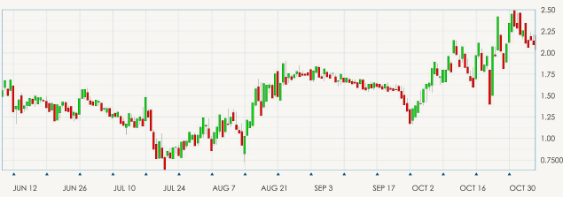
Candlestick Chart – Once you have mastered the line and bar charts, you can move on to the
candlestick chart, which is similar to the bar chart. The vertical lines of both charts illustrate the
trading period’s price ranges, while the body of the candle uses different colors to represent the
market changes of that time period.
For our Chart Analysis, we will be using Candlestick Charts and Patterns. So, in our next lesson,
you will learn more about it.
Images
Comments (0)
- No comments yet.